OERu/Planning/Technology working group/06 June 2014
From WikiEducator
< OERu | Planning | Technology working group
When:
6 June 2014, 12:30PM NZST (Click on link for local time.)
Where: Google hangout
Agenda
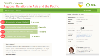
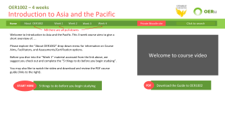
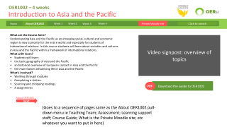
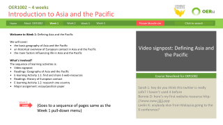
- Sarah Lambert (University of Wollongong)developed and shared a micro course design in Power Point (wide screen format to simulate screen ratios).
- The design is based the design on the OERu public website http://oeru.org/ and a feel for what is working to create an intuitive user-experience on other MOOC sites including Open2Study and my own Reluctant Mathematician (as per the report submitted a few weeks back).
- The design tries to include/design for all the items that were included in the prototoype screen shots for OERu1001 circulated by Tim McCallum to this group last week.
- The design also proposes a visual solution for the micro vs whole course issue which can be used on the OERu public website and as a bridget between the public website and the learning/course website. It allows a student to see which micro they are enrolled in, and which micros follow it and gives them ways to go to the learning or enrol in subsequent micros on the one screen.
- The "About OER1001" menu item is designed as a drop-down menu to hold everything that is non-course materials eg “5 things to do before you start”, “assessment” and “learning support staff” functions. A "course schedule" link could go there too if required.
- However, the design removes the need a separate “course schedule” button if we use “week 1” “week 2” etc as navigation. That’s what worked for students in the UOW Wordpress MOOC (as noted in the report submitted to this group) – the schedule and suggested learning pathway is quite obvious as it is enshrined in the navigation.
- The included graphic elements have been designed as html/hexadecimal coloured boxes in mind, they can have flexible/variable lengths to cater for shorter or longer text labels on them.
- The design aims to work in a responsive design format as per our previous conversations.
Pre-meeting discussion
Wayne Mackintosh provided the following feedback:
- The OERu partners have agreed on the nomenclature of Sessions ---> and Learning pathways (to avoid conflicts with Units, modules, topics, weeks, etc becuase different regions and institutions used different labels.)
- Wayne advises against using "Week" as a main navigation label because different courses may assign different time allocations for the subcomponents (sessions). In some mOOCs a session may be 2 days or longer than a calendar week. Also, if we use weeks as the main navigation element - for full courses we will run out of screen real estate for 13 week courses. We must think about reuse, where different institutions can have the freedom to assign a different time allocation for sub-components of a course.
- As OERu courses are primarily designed for credit - we will need main navigation links to the Course guide (a decision agreed by partners early in the design consultation), Assessments, and learning support resources in the main navigation. I think it may be better to group all the courseware under one navigation item?
- The course schedule concept is useful for providing a gestalt for learners (and flexibility to assign different time allocations) including the key assessment items which contribute to credit. However, I do think that the schedule table in the original SCAN draft needs to be simplified.
Sarah Lambert provided the following comments and reflections on this feedaback:
- I do see the wisdom and necessity of finding nomenclature to aid conversation between partners as we have moved forward. However it is one thing to use them in planning courses and structuring course, but it's another thing to have to use it as navigation items in a website for learners. So for example, i can see that within the context of the numbering system for a Course Schedule, the term Session works well eg http://wikieducator.org/Open_content_licensing_for_educators/Course_guide/Schedule. But in terms of student expectation and standards in web design for eLearning i'm not so sure that "session" or "learning pathway" are the best labels for the navigation items.
- We have gone through three iterations / design consultations on nomenclature. The challenge is that whatever nomenclature works locally - does not translate well internationally. We need to work with the current rough consensus of Sessions & Learning pathways with the understanding that these are customisable labels which can easily be changed with the snapshot approach for local institutional contexts. --Mackiwg 10:20, 6 June 2014 (UTC)
- When i look at the OERu public website and it's listing of it's micro courses, each is either a 2, 3 or 4 week course. I still have a strong preference for Weeks as the navigation method for micro courses, with one menu-item in the drop-down for each activity ("session") in the Learning pathway. The menu becomes an embodiment of the "learning pathway" without having to use the term "learning pathway" anywhere.
- These labels will be customisable for local institutional snapshots -- however, to maximise reuse across an international network, the emerging consensus is to avoid a time-base navigation as the label for navigating courseware. Using generic concept labels will enable OERu partners to change the sequence or insert new "pathways" as desired. The week labels -- if needed, can be accommodated in a course schedule. --Mackiwg 10:31, 6 June 2014 (UTC)
- I also think that we could provide a slightly modified design template that uses either "Topics", "Sessions" or "Learning Pathway" as an alternative to "week X" for the Navigation. I note that this is in the spirit of the Australian planning meeting where we were tasked with coming up with a range of design templates to cater for some diversity of needs.
- We have attempted to agree a universal international nomenclature, but this does not appear to be achievable. On the main OERF/OERu hosted content we have agreed to move forward with Sessions ---> Learning pathways. Using the snapshot approach, Australian institutions will be able to relabel snapshots using any nomenclature they prefer. Topics, Sessions, Modules, Spaceships ... what every suites the local requirements. --Mackiwg 10:31, 6 June 2014 (UTC)
- I agree that a modified design needs to be made for longer courses. I believe with a little more time and attention to this aim, i can provide a design for the longer courses that are a modest reworking of this design. I also suggest that there is a positive benefit is making some sublte colour/styling changes to the design template for full courses vs micro courses.
- Yes let's keep the "course schedule" in the design mix. I am still strongly supportive of having it clustered in a single menu item (which i called "About OER1001" in this design) for all non-course materials.
- I feel that the course/learning materials must be prioritised in the information/navigation/website design so it is always one click away from the home page. I am not a fan of giving most of the navigation real-estate to the admin of the course, and hiding the course content behind a single navigation item with lots of subsequent levels.
Meeting discussion
- Convener: Tim McCallum
- Attendance: Sarah Lambert, Jim Tittsler, Tim Klapdor
- Discussed bridging the OERu.org web site with the actual course site.
- Sarah mentioned that we could have functionality where the user sees (on the OERu.org site) which micro courses they have completed on the learning platform. For example the user may see the first of four micro courses greyed out (if they have completed the first of 4 micros on the learning platform). Sarah referred to this as the half-way house between the two systems (integration).
- Sarah mentioned that the course landing page needs a design which allows the user to understand what to expect (where the content is and how long it takes). Learning materials are prioritised in the information design and the navigation.
- It was discussed that the sequence (next and previous buttons) will mirror the menu in a snapshot implementation. This is currently the case with the Twitter Bootstrap course snapshot. Jim dynamically creates the pages and menus by looping through the bullet list and the source code knows which is the next and previous item in the list.
- Discussed actually coding up Sarah's design (using a combination of the responsive design shown by Tim last week, the graphic design demonstrated in Sarah's power point and the Course Snapshot Javascript which Jim has created in Gitorious. This seems like a good collaboration and each specialist person provides a unique offering.
- Sarah asked a question about making it easier for course creators. She suggested that we create a Word template and a one page guide on how to create a series of Wiki pages which are the structure/outline of the bullet list for the course snapshot. Sarah mentioned that the Visual Editor will ultimately make things even easier.
- Jim and Tim discussed the course outline and how keeping it as shallow as possible would be ideal. We discussed not having a drop down menu hanging off a drop down menu.
Sarah Lambert and Tim Klapdor left early (Sarah's audio dropped in and out and then we lost connectivity).
Action items
- See if we can code up Sarah's design (using a combination of the responsive design shown by Tim last week, the graphic design demonstrated in Sarah's power point and the Course Snapshot Javascript which Jim has created in Gitorious). Implement the graphics/design on about half a dozen content pages ie OER1001?
- Tim will provide Jim with a course outline for OER1001. Jim agreed to run the course.js over with the addition of the dynamic menu code which currently resides in the Wordpress.js. We decided that if nothing else this would be a good demonstration of the combined efforts. If the course looks good and the menus work we may use this for OER1001.
- Consider the technical integration required between the public OERu page and the Course website with regard to the functionality suggested by Sarah's design re being able to see which micros users are enrolled in anytime they come to the Course listing pages, and providing links to enrol in more and/or jump to the course/learning site from the same course listing pages. Perhaps make this an agenda item for future meetings.
- Future task for after templates have been developed: Develop a Word document template to assist course designers to get their content in order before sitting down and cutting and pasting finalised content into the wiki ie building their course/learning website.


