Results
Contents
Writing up the findings

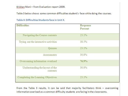
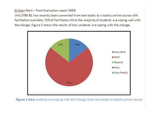
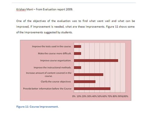
This is the fun part. Once you get responses to the surveys and interviews, think carefully about how you will present the data. There are lots of ideas in the exemplars. Tables are great for most data, and you may decide that a graph shows your findings better. It is best to have either a table of graph in the Results section, but any tables you create can go in the Appendix if they are not used in the Results section. I find that bar graphs are generally the most helpful, just make sure you keep them simple. It is better to have several small and easy to read graphs than one big, messy one with everything on it.
Activity Ten - collecting, analysing and interpreting data for evaluation.
|
Calculations
If you have a small number of responses to a survey, it is best to present the data as number frequencies rather than % frequencies. This is called descriptive analysis and is generally done for the responses to Likert type scales or other closed questions in a survey. My rule of thumb is for up to nine responses, use numbers, and for 10 or more responses calculate percentages. If possible present the data as a mix of tables and graphs and show one set as tables and another as graphs for variety. So it is up to you to decide which data is best as a graph. Include all the tabulated data in the Appendix if it is presented as a graph in the Results.
APA rules for Tables and Figures
When you prepare a table, the caption goes at the top. For a graph or Figure as it is written in a report, the caption goes at the bottom. There are some examples to show you how to present tables and graphs. They don't have to be exactly like this so don't be afraid to be creative. Click on the images to enlarge them so you can see them more clearly.
Summarising survey comments
Data from open questions or comments in a survey, needs to be collated as a summary of responses. This means you summarise the common responses descriptively as themes, not word for word. Responses which are different are kept separate and summarised. For example, three participants may have responded to a question about the design of the online interface used in a course, and made the following comments.
- Participant 1: I really like using the online links as they make it easy to find resources.
- Participant 2: I do not get lost finding the materials I need as the icons are easy to follow.
- Participant 3: Learning using the online materials is very enjoyable because of the colourful and intuitive pathways in the course.
The main themes from these three comments can be summarised as:
- students found navigation in the online course easy; and
- students were satisfied using the online system.
Two of the comments also indicate that students liked learning online - see if you can spot which ones.
One participant may have said the following:
- Participant 4: finding the online materials was difficult because I am not confident using computers. I find it tricky finding my way around, the computer keeps crashing, and I forget how to find my way back to the modules.
This comment could be summarised as: One participant had difficulty navigating the online materials as he was not a confident computer user.


